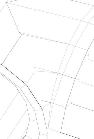
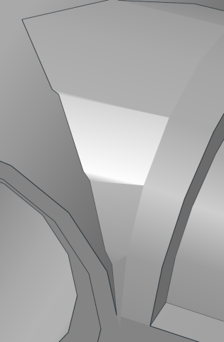
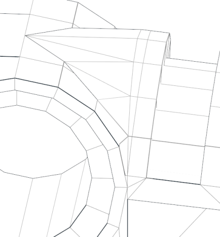
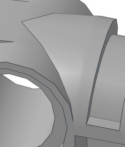
The topic that is bugging me a bit lately, is what should be really put in priority - precise geometry, or cutting down on that a bit, to have model be shaded way more nicely? Example of that would be the cut cylinder on the 50921. It features cylinder cut by the other one. In the current version, it looks like this:

The thin triangles lead to a pretty unpleasant shading, which essentially keeps edges very clear

It can be fixed by merging some of the vertices, but that results in cylinder not being really circular anymore:


I am not sure which approach is favorable. First result has pretty precise shaping, but loses in appearance. Second one is more fine in how it looks, and precision loss, while present, is not that dramatic
The thin triangles lead to a pretty unpleasant shading, which essentially keeps edges very clear
It can be fixed by merging some of the vertices, but that results in cylinder not being really circular anymore:
I am not sure which approach is favorable. First result has pretty precise shaping, but loses in appearance. Second one is more fine in how it looks, and precision loss, while present, is not that dramatic


