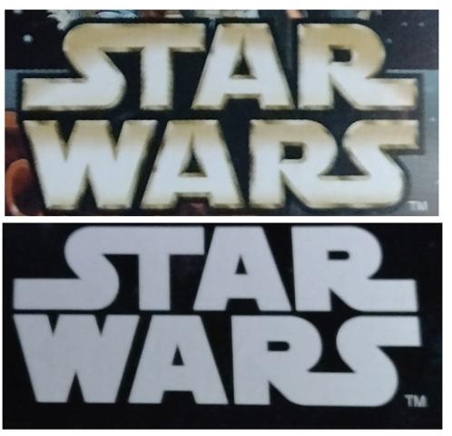
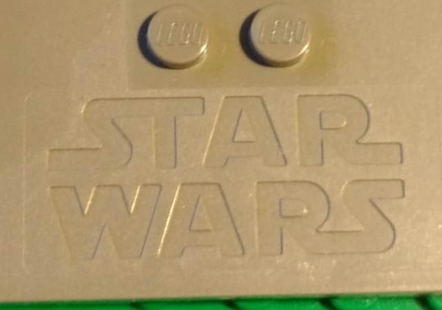
Hmm... Okay I admit there are some subtle differences between the 1999 logo and the modern one.


If you really want to go that route, I would prefer for the letters:
*all lines are properly parallel (issues on the A's)
*equal thickness on all lines (issues on W in particular, haven't checked all yet)
*Curves connect tangential to straight lines (issues on both S's)
I think it's still possible to completely reuse the "ST" shape from the older primitive file.


