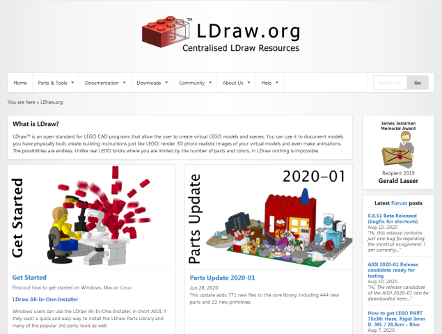
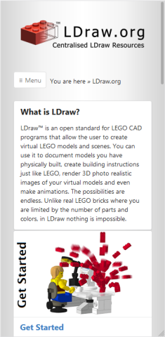
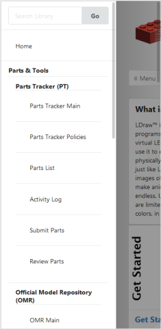
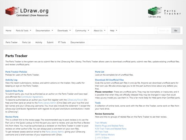
It always helps to see a prototype so, here is an overly detailed mock-up of what my suggested Unified Menu (UM) would look like and how it could potentially look on sub domains and mobile along with a breakdown of the UM tree itself.
Home Page:


Parts Tracker Main:


UM break down:


When first staring to use the website I was confused, in part, because of the navigation differences on the main site and the sub domains. One guideline that don't seem to apply in the site is that the final node on a menu tree should be the clickable one. Now that there is work being done to update many aspects of the website it is the perfect opportunity for everyone to pitch in ideas and suggestions.
Regarding the UM, nothing is set in stone, this is just one iteration attempting to include as much as possible in the menu bar without taking the whole screen and making it as intuitive as I can. Note the inclusion of items like the Facebook group, and the place holder for the submit model page on the OMR, among other things, leaving some potential for growth in the future.
Along with the admins and active contributors, it would be great if regular users stop by and leave their thoughts or comments on this.
Home Page:
Parts Tracker Main:
UM break down:
When first staring to use the website I was confused, in part, because of the navigation differences on the main site and the sub domains. One guideline that don't seem to apply in the site is that the final node on a menu tree should be the clickable one. Now that there is work being done to update many aspects of the website it is the perfect opportunity for everyone to pitch in ideas and suggestions.
Regarding the UM, nothing is set in stone, this is just one iteration attempting to include as much as possible in the menu bar without taking the whole screen and making it as intuitive as I can. Note the inclusion of items like the Facebook group, and the place holder for the submit model page on the OMR, among other things, leaving some potential for growth in the future.
Along with the admins and active contributors, it would be great if regular users stop by and leave their thoughts or comments on this.


